Difference between revisions of "File:Radar.PNG"
(As is shown in the graph, the Y-axis represents the frequency and X-axis represents the counts of responding frequency. The area under the red curve to the right of the threshold shows the possibility we detect the target signal. The area under blue cu...) |
(No difference)
|
Latest revision as of 21:35, 17 August 2018
As is shown in the graph, the Y-axis represents the frequency and X-axis represents the counts of responding frequency. The area under the red curve to the right of the threshold shows the possibility we detect the target signal. The area under blue curve to the left threshold shows the possibility we detect the noise. The area under the blue curve to the right threshold shows the possibility we make a false detection, which will affect the false alarm.
File history
Click on a date/time to view the file as it appeared at that time.
| Date/Time | Thumbnail | Dimensions | User | Comment | |
|---|---|---|---|---|---|
| current | 21:35, 17 August 2018 | 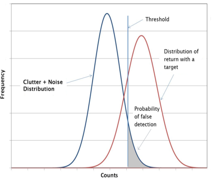 | 430 × 374 (56 KB) | A1651740 (talk | contribs) | As is shown in the graph, the Y-axis represents the frequency and X-axis represents the counts of responding frequency. The area under the red curve to the right of the threshold shows the possibility we detect the target signal. The area under blue cu... |
- You cannot overwrite this file.
File usage
The following page links to this file: